
The Association of Physicians enlisted the team at BCD Meetings and Events to modernize their outdated logo and revitalize their overall brand identity.
2018 • Logo Design, Brand Guidelines, Print Collateral


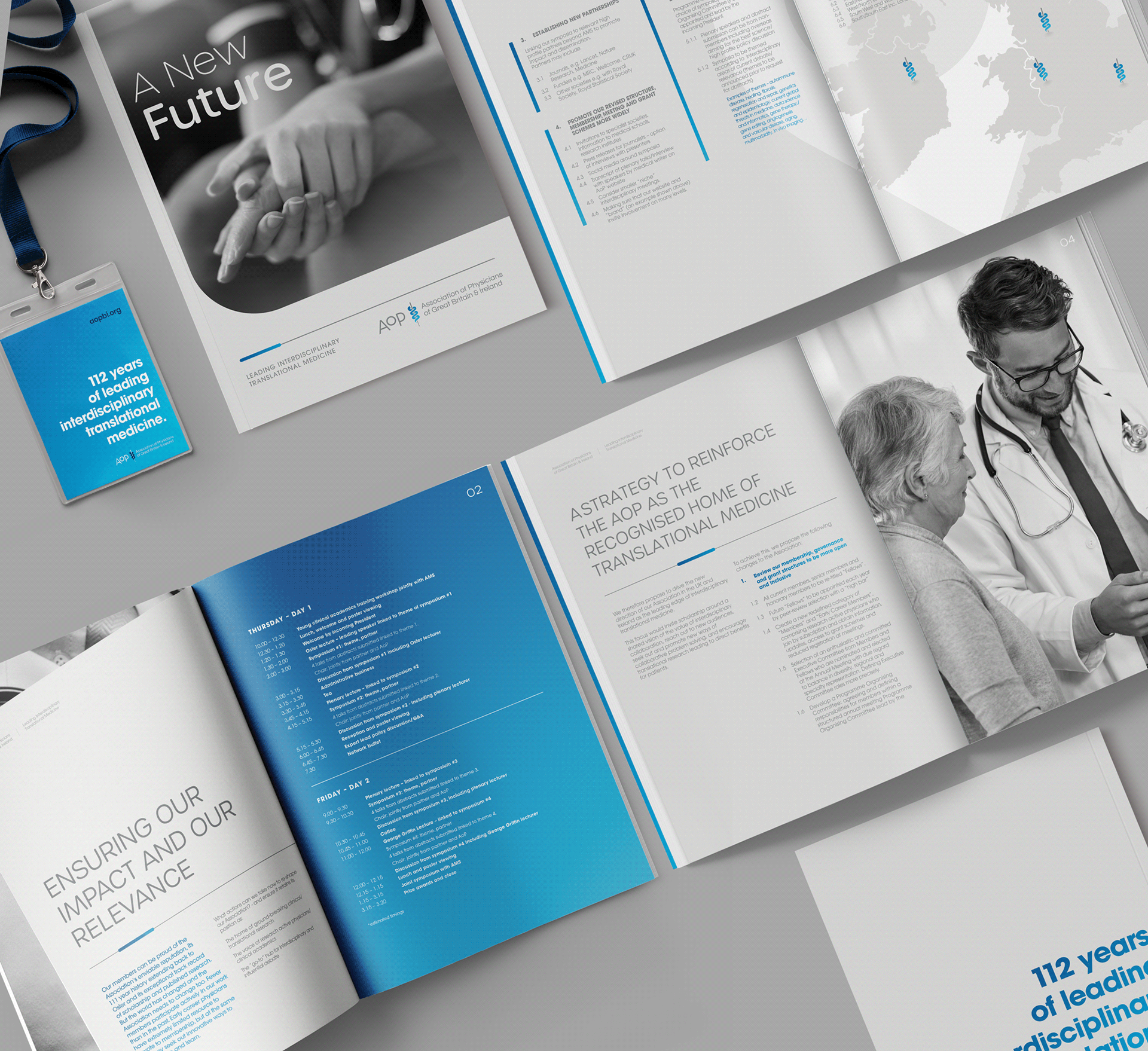
The Association of Physicians (AOP) sought a rebrand to update their visual identity, moving away from a dated logo to something more contemporary and relevant. Tasked with this project while employed at BCD Meetings and Events, I had the opportunity to lead the redesign under the guidance of fantastic Creative Director Dan Umney. We chose to revitalize their image with a custom 'Caduceus' symbol, a recognisable medical emblem featuring a snake entwined around a staff. This new design not only modernised their look but also retained a connection to the medical community's iconic imagery.
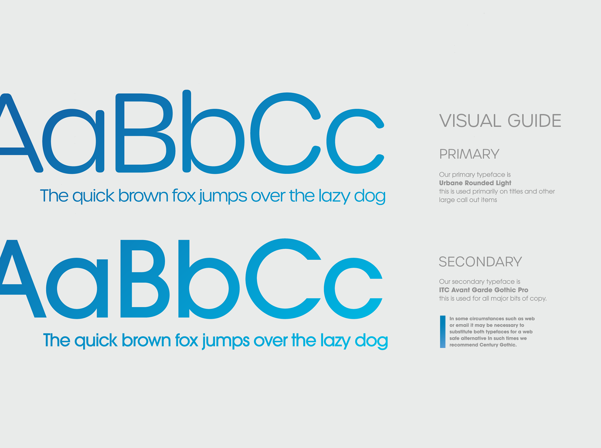
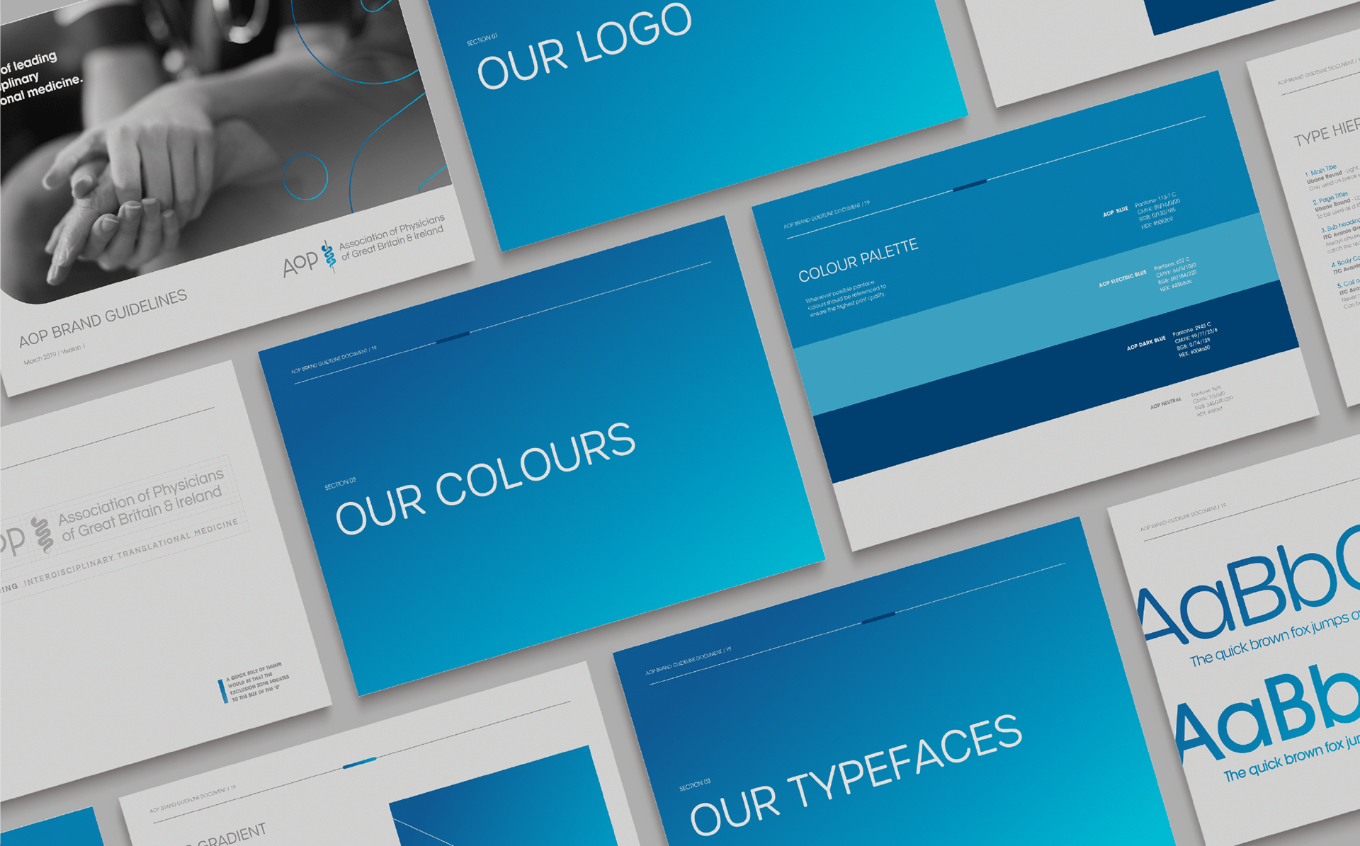
Following the logo's development, we rolled out the new design across all their branding materials and created a comprehensive brochure alongside an elaborate brand guideline document. These efforts provided the AOP with a cohesive and polished brand identity, aligning their visual representation with the professionalism of their members and enhancing their communication across diverse platforms.
This project was created whilst employed by BCDM&E. All rights to this project belong to them.
What we did
Logo Design
Brand Guidelines
Custom Icon
Social Assets
Logo Design
Brand Guidelines
Custom Icon
Social Assets

suzeestudio@outlook.com
+44 (0) 7476022204
+44 (0) 7476022204